Skip to content 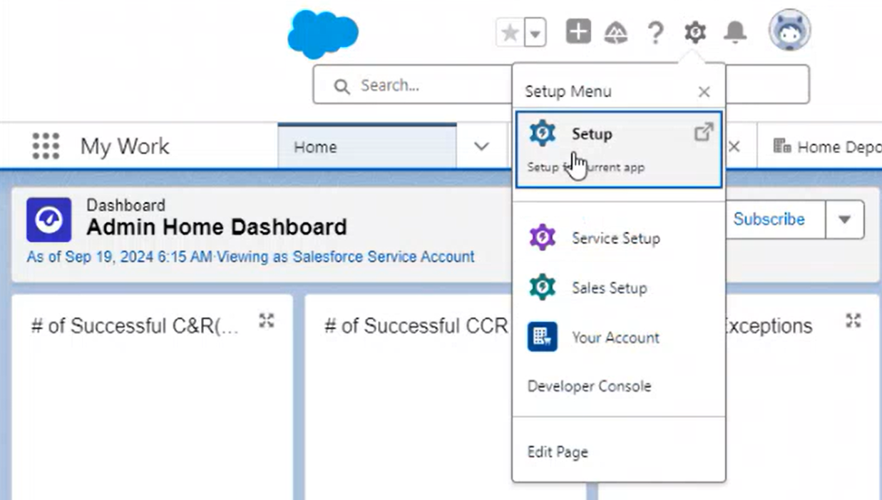
Salesforce
Salesforce is a cloud-based customer relationship management (CRM) platform. The platform has its own Lightning Design System, based on CSS and classes selectors (ZDS uses attributes), and the capability in most cases of add small customizations via CSS custom tokens (like ZDS). This means that both design systems are in fact compatible, so they can be used together, or even being "connected".
How to install and use
The main way of using Zurich Design System in Salesforce is by using the files from the CDN. This approach applies for both: CSS components and Web components. You can check the CDN mechanisms for installation in each package docs.
So once this is clear, the struggle is going to come with making these files available in Salesforce and making sure that these are not blocked by the platform. So we need to whitelist them.
These are the steps to follow:
1. Trusted URLs
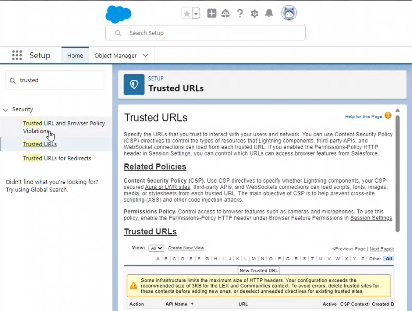
In the app sandbox, set the trusted URLs in Setup (Setup for content app) > Security > Trusted URLs > Content Security Policy (CSP) and adding to the Trusted Sites for Scripts the necessary https://zds.zurich.com URLs or path patterns.


Single sources policy
All the ZDS code it's owned and doesn't come from third parties (even the BlueRoom assets are served via Proxy), so https://zds.zurich.com
will be the only DNS source that you will require to allow.
2. Adding the CDN imports
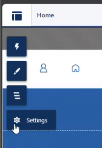
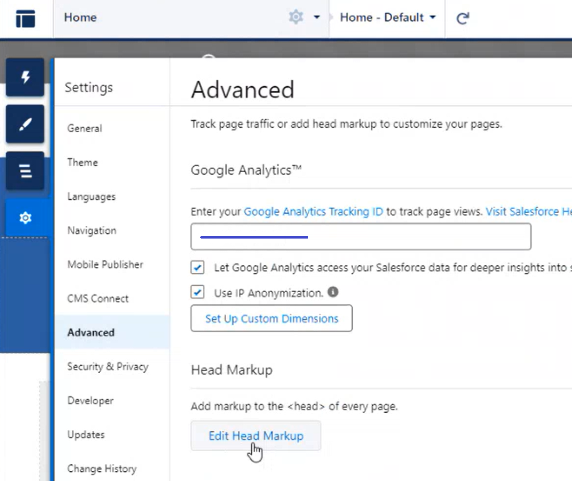
In the site builder, add the imports you require to the <head> of the documents. So go to Settings, and then in the Advanced > Edit Head Markup configuration.
You can control here which are the things you're going to be importing per page or site. So depending on the approach, setup, and needs, you will require to import some or other files. Check the docs and try to stick to a single approach to avoid mixing concepts or loading too much extra code. Each BU will have their own approach.


Standardization
We recommend to have clear guidelines inside the BU about the approach to be used, standards to follow, and way of working with the ZDS. Since ZDS provides building blocks that can be reused as part of more complex components, reading the guidelines of the components and the possibilities that these offer might improve a lot the UX and efficiency of the code.
The Tech Lead of each BU should test and decide the best approach.
An example, if you want to import all the Web Components of ZDS to be available, just use:
html
<link rel="stylesheet" href="https://zds.zurich.com/@zurich/web-components/styles.css" />
<script type="module" src="https://zds.zurich.com/@zurich/web-components/index.js"></script>
We strongly recommend to specify a version to make sure that you stick to a code source and that future releases are not altering the look and/or functionality of your site without being tested, adjusted, and/or approved. We can specify a version, like 1.0.0 in this example:
html
<link rel="stylesheet" href="https://zds.zurich.com/1.0.0/@zurich/web-components/styles.css" />
<script type="module" src="https://zds.zurich.com/1.0.0/@zurich/web-components/index.js"></script>
You can also import specific components:
html
<link rel="stylesheet" href="https://zds.zurich.com/1.0.0/@zurich/web-components/styles.css" />
<script type="module" src="https://zds.zurich.com/1.0.0/@zurich/web-components/button.js"></script>
<script type="module" src="https://zds.zurich.com/1.0.0/@zurich/web-components/accordion.js"></script>
Performance improvements
Our recommendation is to import just the things and or components that are going to be used per page. This can be tedious and requires to take into consideration the list of components used per HTML page, but the the performance of the application will be much better.
Also, consider that some component reuse other components in the Web components approach, so they call the sub-components from their own JavaScript. As an example, Button calls Icon anyway.
The are some components that might be more performant when they are CSS (since they use no JavaScript), so depending
on the needs of the app/project. different approaches might result in performance improvements. If you have any doubts, ask directly the ZDS' Dev team for some consultancy about it.
3. Allowing imported scripts
This applies if you use WebComponents or you are going to import some JavaScript, but might happen in some cases that CSS stylesheets require to be whitelisted too.
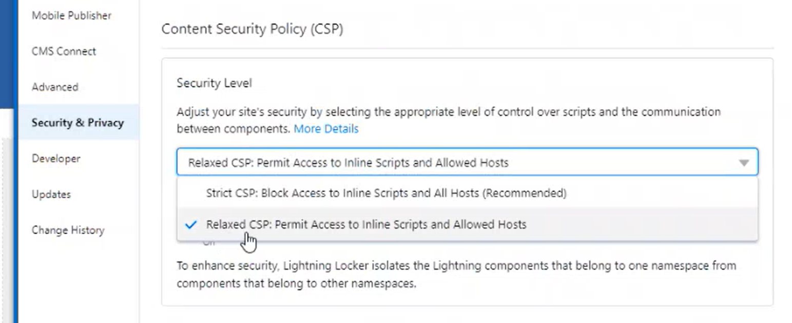
Add the https://zds.zurich.com necessary URLs into the DevAutopages Security & Privacy > Trusted URLs list for the application. You need to make sure that the ContentSecurity Policy (CSP) is set as Relaxed CSP in order to allow inline scripts and allowed hosted ones.

Once this is set, you will be capable of adding the required paths to the Trusted sites for scripts list.
Now, just save the changes done in the builder.
4. Use the components in your templates
You can now write the code of the component and have this rendered, in addition to the utils and design tokens.
So just open your IDE with the app/project and use the components as their are described in the documentation of each one.
Web components as externals
In case of using Web Components, use the lwc:external attribute in the component to indicate Salesforce that the component should be ignored by Salesforce's compiler, so it's fully handled in the browser and not considered as an internal component.
html
<template>
  <z-button config="positive" lwc:external>Button</z-button>
</template>
As previously mentioned, you can combine both design systems and technologies without any conflicts. This code will work:
html
<template>
  <z-card
    lwc:external
    class="slds-col"
  >
    <div class="slds-grid slds-wrap">
      <div class="circle slds-col slds-size_1-of-3 slds-align_absolute-center">
        <p class="info">3432</p>
      </div>
      <p class="info slds-col slds-size_2-of-3 slds-align_absolute-center">
        Lines of coverage
      </p>
      <z-button
        lwc:external
        class="slds-col slds-size_2-of-3"
      >
        Click me!
      </z-button>
    </div>
  </z-card>
</template>
Design Systems override and combination
You can event override the Salesforce's Lightning Design System tokens with ZDS ones. Check the Foundations section to check the available tokens we provide and mechanisms like the theming or the semantic tokens
scss
/* SCSS tokens */
$brand-background-dark: var(--z-bg-brand--bold);

/* Or directly the CSS tokens per component */
button.slds-button {
  --slds-c-button-brand-color-background: var(--zc-blue-zurich);
}
This approach can allow to override the components and the look and feel of the Lightning component and tooling to be more similar to the ZDS specifications, or the other way around.
Aura components
Aura components
We have not found yet a proper way of using the ZDS components with Aura components. We will try to find a way in the future.