Skip to content 

Dev utils
Attention!
This package is still in design phase. But you can use it during the development.
The @zurich/dev-utils NPM package is a package wit JavaScript (TypesCript) and SCSS code that can help to improve the whole DX (Development Experience) and QA (Quality Assurance) processes when su are using the Zurich Design System.
Install
The are two ways of installing the package:
Via CDN
Simply import the script in the <head> of your HTML:
html
<!DOCTYPE html>
<html lang="en">
  <head>
    <script type="module" src="https://zds.zurich.com/0.5.18/@zurich/dev-utils/web-cli.js"></script>
  </head>
</html>
The available files are:
Local installation
You can also install it locally and get access to the SCSS and all the tools provided. We need to install the package:
bash
npm i -D @zurich/dev-utilsAnd then import the functionality in the context where is going to be used.
ts
import { isBoolean } from '@zurich/dev-utils/helpers'Check each section to know about the imports.
Helpers
We offer a big collection of useful functions that can help developers. We do not recommend to use it via CDN because of performance issues, since you will be importing all the helpers.
You can import them from @zurich/dev-utils/helpers:
ts
import { isBoolean } from '@zurich/dev-utils/helpers'Check all the available helpers in here.
Web CLI
Attention!
Do not use the Web CLI in production. This is only a tool for development and QA.
In order to use the Web CLI, we need to import it in the use context.
scss
@import '@zurich/dev-utils/web-cli';It can be import via CDN too:
html
<!DOCTYPE html>
<html lang="en">
  <head>
    <script type="module" src="https://zds.zurich.com/0.5.18/@zurich/dev-utils/web-cli.js"></script>
  </head>
</html>
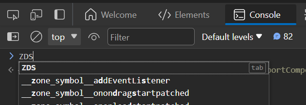
Once the import is done, you would be able to access the Web CLI just by opening the dev tools of the browser and opening the console. Then just type ZDS. and the list of available commands will appear:


INFO
The Web CLI is included in every page of this documentation, so you can play with it.
Functions
This is the list of available function:
help: prints the help text.Printers:
print: prints a content with the given styles.printImage: prints in the console the image provided via param.printCodeBlock: prints a code block in the console.
Inventory:
listCSSComponents: returns a list with the ZDS' CSS components in the document.listWebComponents: returns a list with the ZDS' Web components in the document.listAngularComponents: returns a list with the ZDS' Angular components in the document.
Report:
reportCSSComponents: elaborates a table of CSS components and helpers and their attributes.reportWebComponents: elaborates a table of Web components and their attributes.
SCSS
In order to use the SCSS functionality, we recommend to import the index.scss using @use:
scss
@use "@zurich/dev-utils/src/SCSS/index.scss" as *;SCSS component vars
You can access the components' tokens aliases via the components.scss file:
scss
@use "@zurich/dev-utils/src/components.scss" as comp;

$my-var: comp.$button--bg;
These SCSS variables point to the primitive and semantic CSS tokens used in @zurich/design-tokens.
SCSS Functions
We offer functions to ease the development.
This is the list of available functions:
- Operators:
@function if($condition, $if-value, $else-value): a regular tertiary operator.
SCSS Mixins
We offer mixins to ease the development based on our foundations.
This is the list of available mixins:
- Breakpoints:
desktop: a media query to use CSS only indesktopsize.landscape: a media query to use CSS only inlandscapesize.landscapeOrSmaller: a media query to use CSS only inlandscapeor smaller sizes.landscapeOrBigger: a media query to use CSS only inlandscapeor bigger sizes.portrait: a media query to use CSS only inportraitsize.portraitOrSmaller: a media query to use CSS only inportraitor smaller sizes.portraitOrBigger: a media query to use CSS only inportraitor bigger sizes.mobile: a media query to use CSS only inmobilesize.portraitAndLandscape: a media query to use CSS only betweenportraitandlandscapesizes.

