Mendix
Mendix is one of the low-code platforms used by some of the Business Units of Zurich. Owned by Siemens and developed in Java (for backend) and React (for frontend), with React Native for mobile implementations.
Common styles
In order to have the design tokens available in your app, you only need to import the tokens via CDN on top of the App > Styling > web > custom-variables.scss of the main App module (check the image on the side).
scss
// custom-variables.scss

@import "https://zds.zurich.com/0.5.14/@zurich/design-tokens/index.css";
@import "https://zds.zurich.com/0.5.14/@zurich/css-components/atoms.css";
In case you want to use the input components or data library components you will require to add an extra imports in the same file:
scss
// custom-variables.scss

@import "https://zds.zurich.com/0.5.14/@zurich/web-components/inputs.css";
@import "https://zds.zurich.com/0.5.14/@zurich/web-components/data.css";
In case you would require to override some of the token, you can do it inside the same file as:
scss
body {
  --z-my-component--color: #ff0000;
}
Components
Creation of wrappers
Mendix has it's own format for handling components as widgets.
@mendix/pluggable-widgets-tools
json
{
  "extends": "@mendix/pluggable-widgets-tools/configs/tsconfig.base",
  "compilerOptions": {
    "baseUrl": "./",
  },
  "include": [
    "./src",
    "./typings"
  ]
}
json
{
  "name": "icon",
  "widgetName": "Icon",
  "version": "1.0.0",
  "description": "My widget description",
  "copyright": "© Zurich 2024. All rights reserved.",
  "devDependencies": {
    "@zurich/css-components": "latest",
    "@zurich/web-components": "latest",
    "@mendix/pluggable-widgets-tools": "latest"
  },
  "engines": {
    "node": ">=18"
  },
  "license": "Apache-2.0",
  "config": {
    "projectPath": "./apps/mendix_app/",
    "mendixHost": "http://localhost:8080",
    "developmentPort": 3000
  },
  "packagePath": "zurich",
  "scripts": {
    "start": "pluggable-widgets-tools start:server",
    "dev": "pluggable-widgets-tools start:web",
    "build": "pluggable-widgets-tools build:web",
    "lint": "pluggable-widgets-tools lint",
    "lint:fix": "pluggable-widgets-tools lint:fix",
    "test:unit": "pluggable-widgets-tools test:unit --coverage",
    "prerelease": "npm run lint",
    "release": "pluggable-widgets-tools release:web"
  },
  "resolutions": {
    "react": "18.2.0",
    "react-native": "0.72.7",
    "react-dom": "18.2.0",
    "@types/react": "18.2.0",
    "@types/react-dom": "18.2.0"
  },
  "overrides": {
    "react": "18.2.0",
    "react-native": "0.72.7",
    "react-dom": "18.2.0",
    "@types/react": "18.2.0",
    "@types/react-dom": "18.2.0"
  },
}
...
xml
<?xml version="1.0" encoding="utf-8"?>
<package xmlns="http://www.mendix.com/package/1.0/">
  <clientModule
    name="Icon"
    version="1.0.0"
    xmlns="http://www.mendix.com/clientModule/1.0/"
  >
    <widgetFiles>
      <widgetFile path="Icon.xml" />
    </widgetFiles>
    <files>
      <file path="zurich/icon" />
    </files>
  </clientModule>
</package>
xml
<?xml version="1.0" encoding="utf-8"?>
<widget
  id="zurich.icon.Icon"
  pluginWidget="true"
  needsEntityContext="true"
  offlineCapable="true"
  supportedPlatform="Web"
  xmlns="http://www.mendix.com/widget/1.0/"
  xmlns:xsi="http://www.w3.org/2001/XMLSchema-instance"
  xsi:schemaLocation="http://www.mendix.com/widget/1.0/ ../../node_modules/mendix/custom_widget.xsd"
>
  <name>Icon</name>
  <description>My Icon description</description>
  <studioProCategory>ZDS - Atoms</studioProCategory>
  <icon> <!-- ...  --> </icon>
  <properties>
    <propertyGroup caption="General">
      <property key="icon" type="enumeration" required="true" defaultValue="alert_circle">
        <caption>Icon</caption>
        <description>...</description>
        <enumerationValues>
          <enumerationValue key="alert_circle">alert-circle</enumerationValue>
          <enumerationValue key="alert_triangle">alert-triangle</enumerationValue>
          <!-- ...  -->
          <enumerationValue key="zoom_out">zoom-out</enumerationValue>
        </enumerationValues>
      </property>
      <property key="iconStyle" type="enumeration" required="true" defaultValue="solid">
        <caption>Style</caption>
        <description>...</description>
        <enumerationValues>
          <enumerationValue key="solid">Solid</enumerationValue>
          <enumerationValue key="outline">Outline</enumerationValue>
        </enumerationValues>
      </property>
      <property key="size" type="enumeration" required="true" defaultValue="m">
        <caption>Size</caption>
        <description>...</description>
        <enumerationValues>
          <enumerationValue key="xs">XS - Extra small</enumerationValue>
          <enumerationValue key="s">S - Small</enumerationValue>
          <enumerationValue key="m">M - Medium</enumerationValue>
          <enumerationValue key="l">L - Large</enumerationValue>
        </enumerationValues>
      </property>
    </propertyGroup>
    <propertyGroup caption="Display">
      <property key="color" type="enumeration" required="true" defaultValue="azure">
        <caption>Color</caption>
        <description>...</description>
        <enumerationValues>
          <enumerationValue key="azure">Azure</enumerationValue>
          <enumerationValue key="teal">Teal</enumerationValue>
          <enumerationValue key="moss">Moss</enumerationValue>
          <!-- ...  -->
          <enumerationValue key="zurich_blue">Zurich blue</enumerationValue>
        </enumerationValues>
      </property>
    </propertyGroup>
  </properties>
</widget>
tsx
import { ReactNode, createElement } from "react";
import { replaceAll, toAttr, kebabCase } from '@zurich/zds-utils';

import { isStyledIcon } from './Icon';

import type { IconPreviewProps } from "../typings/IconProps";
import type { ZDS_CSS_Styles } from '@zurich/css-components/types';

function parentInline (node?: HTMLElement | null): void {
  // Temporary fix, the web modeler add a containing div, to render inline we need to change it.
  if (node?.parentElement?.parentElement) {
    node.parentElement.parentElement.style.display = "inline-block";
  }
}

export function preview (props: IconPreviewProps): ReactNode {
  const icon = replaceAll(props.icon, '_', '-');
  const style = props.iconStyle === 'solid' ? '' : 'line';

  return (
    <div ref={parentInline}>
      <i
        z-icon
        icon={toAttr(icon, style)}
        fill={kebabCase(props.color)}
      ></i>
    </div>
  );
}

export function getPreviewCss (): string[] {
  return [
    require("../../node_modules/@zurich/design-tokens/dist/Icons.css"),
    require("../../node_modules/@zurich/css-components/dist/Icon.css"),
  ];
}
tsx
import { ReactNode, createElement } from 'react';

import { ZrIcon } from '@zurich/web-components/react';
import { kebabCase, toAttr, replaceAll } from '@zurich/dev-utils/helpers';

import type { IconContainerProps } from '../typings/IconProps';

export function Icon (props: IconContainerProps): ReactNode {
  const icon = replaceAll(props.icon, '_', '-');
  const style = props.iconStyle === 'solid' ? '' : 'line';

  return (
    <ZrIcon icon={toAttr(icon, style)} fill={kebabCase(props.color)} />
  );
}
Use
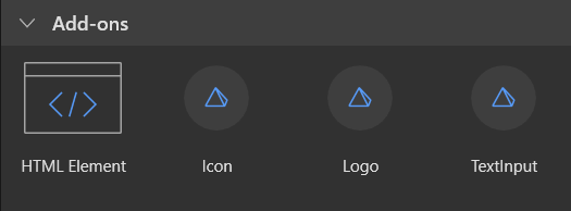
When you're layout view, you will find a Toolbox tab in the panel on the right with a selector for Widgets and Building blocks.
Inside the Widgets selector, you will find some sections at the end prefixed as ZDS - <category_name>, with the collection of available components imported per category from the marketplace.