Documentation
This documentation is developed using Vitepress with a custom configuration and our own modifications.
...
Search
On the top (or using the shortcut Ctrl + K), you can use the documentation general search.
Components
The components are divided into different categories:
Each component will have three possible pages:
- Development info: (default) ...
- Guidelines: ...
- Figma: ...
Status bar
...
For Figma:
 Figma: ...
 Figma plugin: ...
As Framework selectors:
 CSS: ...
 @zurich/css-components'%20d='M61.1%2031.4H141L123.4.7H78.7zm53.7%2031.9H159l-15.9-26.8H98.8'%20opacity='.9'/%3e%3cpath%20fill='url(%23b)'%20d='M141.3%20100.3H61l17.6%2030.5h45zm-26.5-31.9H159l-15.9%2026.8H98.8'%20opacity='.9'/%3e%3cpath%20fill='%23010101'%20d='M78.6%20130.8%2041%2065.8%2079.1.8H37.9L.4%2065.8l37.5%2065z'/%3e%3c/g%3e%3c/svg%3e) WebComponent: ...
WebComponent: ... @zurich/web-components Angular: ...
 @zurich/web-components'/%3e%3cellipse%20rx='11'%20ry='4.2'%20transform='rotate(120)'/%3e%3c/g%3e%3c/svg%3e) React: ...
React: ... @zurich/web-components Vue: ...
 @zurich/web-components'/%3e%3cellipse%20rx='11'%20ry='4.2'%20transform='rotate(120)'/%3e%3c/g%3e%3c/svg%3e) React Native: ...
React Native: ... @zurich/react-native
For platforms:


'%3e%3cpath%20fill='%23146ff4'%20d='M0%2042A42%2042%200%200%201%2042%200h172a42%2042%200%200%201%2042%2042v172a42%2042%200%200%201-42%2042H42a42%2042%200%200%201-42-42z'/%3e%3cpath%20fill='%23000'%20fill-opacity='.1'%20d='M0%200h256zm256%20214a50%2050%200%200%201-50%2050H50a50%2050%200%200%201-50-50c0%2018.8%2018.8%2034%2042%2034h172c23.2%200%2042-15.2%2042-34zM0%20256V0zM256%200v256z'%20mask='url(%23b)'/%3e%3cpath%20fill='%23fff'%20d='M99.5%20158.3c3-6%2010.6-11.3%2021.9-11.3%2020.4%200%2024%2016.3%2024%2023v40.7l20-30.4-19.6-32h23l9.7%2019.8%209.7-19.7H211l-19.6%2032L213%20213h-23.1l-11.4-20.4L167%20213h-41.4v-35.7c0-10.1-3.5-13.3-9.7-13.3-8.3%200-12%206.8-12%2016.8V213H84.4v-35.7c0-10.1-3.5-13.3-9.7-13.3-8.3%200-12%206.9-12%2016.8V213H43v-64.6h15.7l1%208.5h.4c4.5-6.9%2011-9.9%2019.1-9.9%2010.1%200%2016.9%205%2020%2011.3z'/%3e%3c/g%3e%3c/svg%3e)
...
Parameters
...
Playground
...
Virtualization
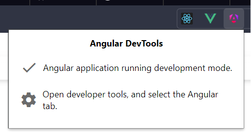
When you use the Playground, the documentation is rendering the component with the actual target framework or approach. This allows to check the real behavior of the component but also using the framework DevTools to inspect what is going on. The DevTools based on the supported frameworks would be:
Configuration
If you go to the configuration page, you would be able to configure the documentation in order to adapt it to the needs you could have. Some of this configuration values are:
Root font size: since the whole design system is adapted to use
remCSS units, when you change thefont-sizevalue in the:rootselector of CSS, all the UI will be scaled. Here you have a selector to chose this root size to preview everything with the corresponding scaling.Root locale: the main locale of the site in defined bia the
langattribute of the<html>document tag. This is used in JS and CSS as the selector to adapt the components to the corresponding localization. Her's a selector to stablish ling language in the documentation to some other that is noten-US(default one).Default framework: since the renderization and code examples of the components can be presented in several frameworks, even when you can change them in the documentation page of the component: you can stablish your preferred one in here and will be remembered between sessions.