Basic concepts
...
The development tools
Once the design part is done, the Dev team of ZDS needs to translate the designs and specifications into code libraries that interpret the set of foundations, components and guidelines from a technical perspective to come with a translation into development tools that can be:
- Easy to install, use, and integrate with different workflows, frameworks and programming languages.
- Can support the widest amount of devices, browsers, viewports, etc.
- Have a concise documentation about the use of the libraries and the configuration and application of the components.
- Have tooling developed around the coding environments to improve de DX and easy and speed the development when our libraries are used.
- Have a consistent framework/language for the development basis that can ease the adaptation of developers between projects by sharing a big part of the code base with these libraries.
Versioning
All packages that are released with an specific version are 100% compatible. That means that the version common to the whole ecosystem. This reduces the confusion or having to deal with incompatibilities. Just one number per release for all packages. That applies to the interdependencies, so version 1.2.3 of @zurich/css-components would use the version 1.2.3 of @zurich/design-tokens. Even when this can lead to package versions with no changes at all, it help us keep the consistency as set, making sure that when a component is released, changed, or fixed, this is going be applied to all the packages consistently, setting the concept of the design system as a whole.
For the versioning, we use the NPM standard of semantic versioning, so all standards apply to our libraries.
Even when there are some ways of using different versions of the ZDS at the same time, we encourage not to do so and ask the ZDS team if some special needs need to be considered so we can provide the best solution possible. An example of this will be using new components of higher minor versions with a previous package version. This is possible, but requires to be tested for compatibility in each case.
Packages
The development part of Zurich Design System are in the end on 4 different packages that are served via NPM as public packages, so they are open and don't require any type of authentication to be installed. That eases the integration with every kind of project.
Here's a diagram showing the available packages and their relationships:

@zurich/dev-utils is an independent package that contains development utils that can be used during the coding and testing, but that are not relevant for production and will be transpiled (like SCSS or TS utils). When this package is used to build the others (like some of their SCSS code), it leaves no footprint or dependency after build.
As you can check, the @zurich/design-tokens (just CSS) package is the base of almost all packages. @zurich/css-components (just CSS) and @zurich/web-components (CSS + JS) use it as a direct dependency.
The @zurich/react-native just uses @zurich/web-components for the typing, to ensure that the API of the WebComponents is the same (or as close as possible ensuring compatibility) as for the React Native components in order to reduce complexity and make them interchangeable. Also, the @zurich/react-native library doesn't use CSS mechanics, so the customization of the components works differently.
To know more about each package, check the packages installation section, and in order to know which package you should use, check the "how it works" section to know about the mechanics and compatibilities of the Zurich Design System.
TypeScript and JSDoc
...
Check the available packages.
We are providing TypeScript support to all the libraries; including the ones that only implement CSS. This ensure, not only a great developer experience (DX) due to the intellisense and error identifications that TypeScript provides, but allows to have a smoother adoption of the ZDS as a tool without having to continuously check the documentation.
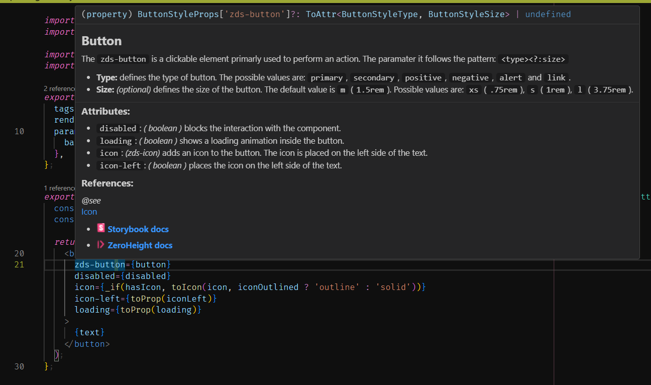
We've also added a great inside documentation for every component, attribute, and functionality using JSDoc, so everything you need in order to use each feature can be consulted without leaving your IDE. This includes explanations, description, examples with snippets, links, and even visualization examples.
Static assets
In order to provide a great service, we need to make sure that we are providing all the necessary assets in a well thought nd optimized way. That's why we have our own CDN with versioned, systemized, and optimized assets to be consumed for third parties.
This CDN is ensured for high availability and really fast access for all the regions we give support to.
CDN Code
Most of our packages are also available to be consumed via CDN link, not only via local installation. That allows Fast prototyping and super easy use of the components and features of our ZDS. Check each package to check how to use them via CDN.
Consumables
Attention!
The CDN is still not ready due to the cloud infrastructure.
The Zurich Design System hosts all the necessary assets to utilize the components and code implementations in its own CDN. This avoids the need of having to serve again everything regarding the ZDS, saving costs and reducing the complexity for start using it.
The high availability endpoints are:
https://www.zds.zurich.com/<version>/<category>/<path>: access to the different produced assets via HTTPS URLs (SVGs, PNGs, JPEGs, etc.). The<category>options would go according to the asset type:
- `i` - icons
- `p` - pictograms
- `favicons` - favicons
- `fonts` - fonts
- `img` - images
- `shapes` - shapes
https://www.zds.zurich.com/<version>/docs/<path>: access to the different produced code chunks (CSS, TS, JS, HTML, etc.). The<package>options would go according to the available packages.https://www.zds.zurich.com/<version>/docs/<path>: access to assets (PNGs) that VSCode and other IDEs will be using to document the code by using JSDocs.
BlueRoom assets
Attention!
Still in discussion
...